The Dead Rabbit
Where Tradition Meets Tomorrow
When Crown Creative joined forces with The Dead Rabbit as its creative partner, the challenge was to rejuvenate a beloved brand and the world's most acclaimed pub. In this repositioning, preserving The Dead Rabbit's storied reputation and dedicated following through our design work was imperative - to honour tradition while boldly pivoting the focus towards a future that embodies progress and innovation.
While The Dead Rabbit had been incredibly successful, the brand had steered over time towards a dark, sinister, and overtly masculine direction. This assessment was pivotal in guiding us towards reimagining the brand's essence.
We also saw the opportunity to recapture narratives that had been somewhat obscured over the years, such as the Irish American immigrant story, and an appreciation of Irish craft and artistry central to the brand’s original positioning.
Strategy | Branding | Collateral | Website Design | Content Creation | Partnerships
An award-winning menu
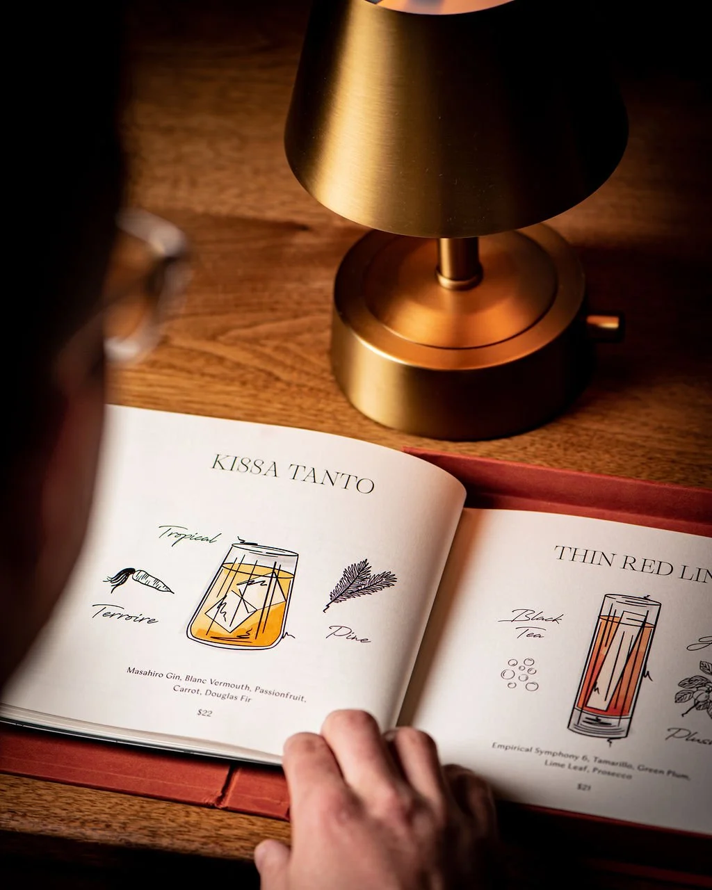
Inside the Parlor menu is a collection of cocktails that draws inspiration from people, places, and stories - in Ireland, and the rest of the world too. Each section is based on the traditional classics known and loved, with a contemporary version that represents the road that lies ahead. The dedicated cocktail menu was made to be the centrepiece of experience at the Parlor, featuring illustrations of each cocktail and the ingredients of each recipe.
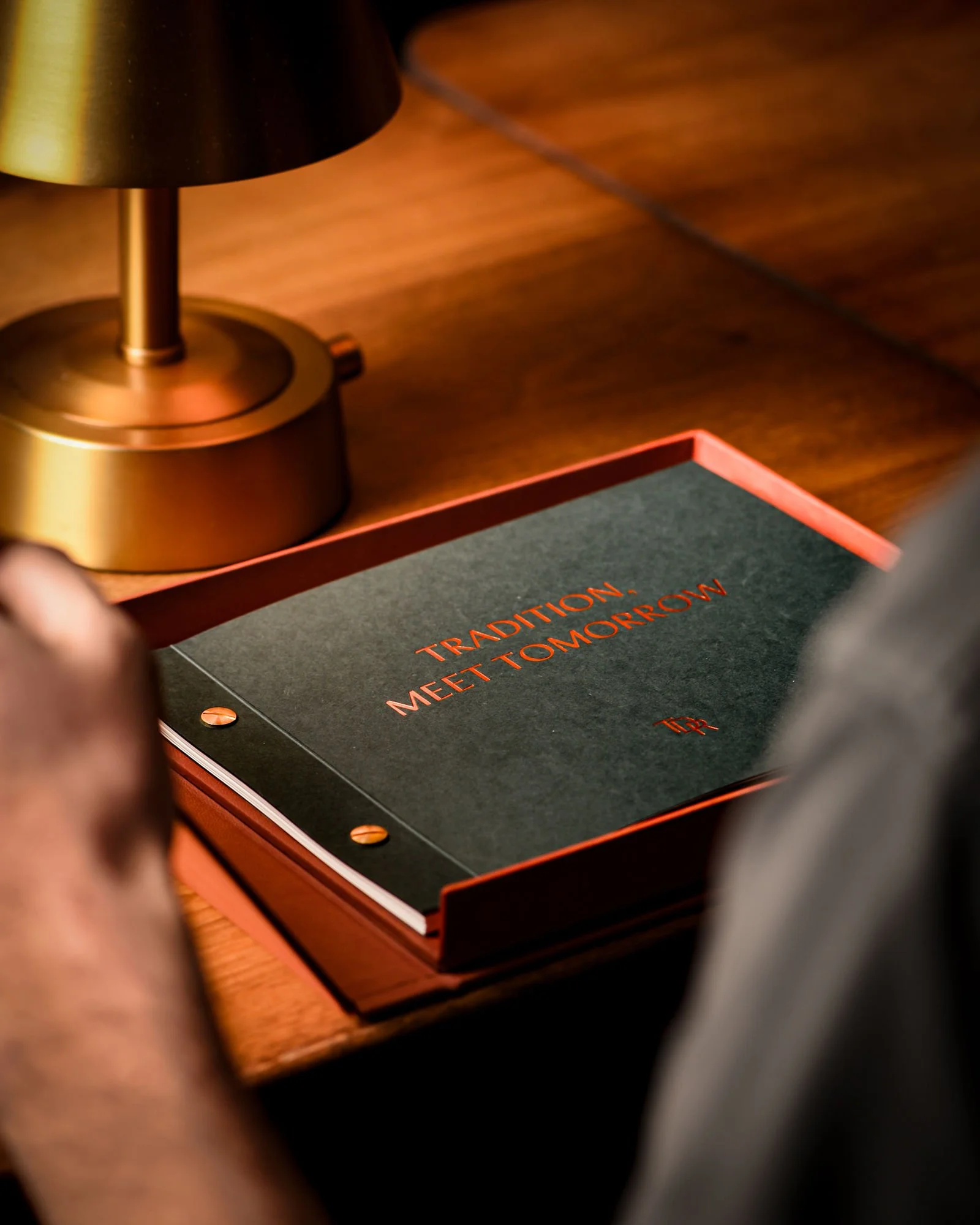
Rooted by ‘Tradition, Meet Tomorrow,’ the Parlor Menu is built to showcase a love of the print craft and create an experience for guests. A landscape menu book in a magnetic clamshell close structured box captures a curated elegance. Echoing Irish history, debossed foil type sits on the linen fabric-covered box front and spine, enclosing a screwpost bound menu. A keepsake passport-sized insert sits in a pocket of the lined inner cover, for guests to treasure. Rich natural tones of the terracotta linen and foil compliment the green, white, yellow and brown inner pages of the menu. GF Smith, Gmund Bier card used for the menu pages is made using chlorine-free pulp and spent brewer’s grain. The flecks of grain create a hint of texture and colour on each page. With FSC certification and 75% of the energy to produce this card using regenerative energy, sustainability was considered in the menu’s composition.
Storytelling is portrayed throughout the menu’s detail of each cocktail and echoed in the style of illustration. The loose hand-drawn pen and charcoal sketches feel like note-making in an artist’s sketchbook representing ‘Tradition,’ paired with marker colour fill representing ‘Tomorrow.’ The energetic lines in the illustration emulate the fine lines and serifs found throughout the menu type. Small illustrations of core ingredients of the recipe surround each cocktail, furthering the visual narrative of the menu. The painterly sketch-style illustrations capture each cocktail with artistry that reflects the art of the cocktail recipe itself.
The Parlor menu won the IDI Editorial and Print Design Award in 2023.


